Introduction
Metro systems are an interesting way to learn more about the growth of a city over time. You can see things like how the city expanded as public transit spread farther and farther from the original city limits. You can also see how the city center moved from certain neighborhoods to others. One example of this is the city of Paris, where I currently live, which started off just having metro stops along the river, and then quickly spread to a more circular shape over time. The gif below shows that progression over time. Blue dots are metro stops and the red dot is the center of the metro system.
By the end of this post you will be able to make that gif yourself, as well as gifs for three other European cities. To do this we’ll be playing around with several R packages with the final goal of making gifs with Delaunay triangulations. Of the packages we’ll be using, several will be from the tidyverse. However, instead of loading them all in one package, we’ll load each separately so you can get a better idea for what each package can be used for. In the future though I highly recommend the single library(tidyverse) call to make your life easier. I’ve already started updating my old scripts with the new bundled package!
TAKE AWAY POINTS FROM THIS POST
- With
ggmapyou can use Google Maps within theggplot2environment. -
Delaunay triangulation is a way to compute the area and centroid of a strangely shaped polygon, and can be computed in R with the
deldirpackage. -
The package
gganimatecan be used to show time series data as an animation. -
For some reason Barcelona only felt the need for one metro stop in 1912.
Data
Today’s data is the location of metro stops in four European cities: Paris, Berlin, Barcelona, and Prague. To collect the names of stops from each city I went to the Wikipedia article for each respective city’s metro system. I also coded if the stop was actually in the city being analyzed or a different town, usually bordering the city.
With my data in place I began to work with it in R to organize it. I used three packages to start off, dplyr, tidyr (both in tidyverse), and ggmap. The packages dplyr and tidyr have been discussed previously in this blog, but ggmap is new. With ggmap you can download maps from various sources, including Google Maps, and plot them in the ggplot2 environment. I first read in my data and then create a new column called geo_location by combining the station and location columns with a unite() call. I also use the separate() call, the converse of unite() to split the opened column (which refers to the date when the stop was opened) into three columns, one for month, day and year. Now I get to use my first ggmap call, mutate_geocode(). I can feed the call my geo_location column from my data frame and it will make two new columns, lon and lat, finding the longitude and latitude of each stop, and add these values to my new columns. Note, I originally tried added the word “Station” at the end of the stop for all stops but this caused problems.
library(dplyr)
library(tidyr)
library(ggmap)

data = read.table("data_metros.txt", header=T, sep="\t") %>%
    unite(geo_location, c(station, location), sep = ", ", remove = FALSE) %>%
    separate(opened, into = c("opened_month", "opened_day", "opened_year"), sep = "/") %>%
    mutate_geocode(geo_location, source = "google")
The output from Google Maps is not exactly the same as the Google Maps API. I tried to hand correct errors as much as possible, but I am not an expert on European Metro systems. If you see an erroneous data point from your city feel free to let me know! The final data below is thus a combination of data from the mutate_geocode call and any hand correction on my part. Below you can see a table of some of the the data we’ve created. I’ve only included the first 5 and final 5 data points for the sake of space, but you can look at all of the data in the GitHub repository.
data = read.table("data_metro_full.txt", header = T, sep="\t")| city | geo_location | location | station | line | opened_month | opened_day | opened_year | lon | lat |
| Paris | Abbesses, Paris, France | Paris, France | Abbesses | 12 | 10 | 31 | 1912 | 2.338559 | 48.884304 |
| Paris | Alésia, Paris, France | Paris, France | Alésia | 4 | 10 | 30 | 1909 | 2.327058 | 48.828198 |
| Paris | Alexandre Dumas, Paris, France | Paris, France | Alexandre Dumas | 2 | 1 | 31 | 1903 | 2.3944193 | 48.8563262 |
| Paris | Alma – Marceau, Paris, France | Paris, France | Alma – Marceau | 9 | 5 | 27 | 1923 | 2.3522219 | 48.856614 |
| Paris | Anatole France, Levallois-Perret, France | Levallois-Perret, France | Anatole France | 3 | 9 | 24 | 1937 | 2.284904 | 48.892226 |
| Prague | Vltavská, Prague, Czech Republic | Prague, Czech Republic | Vltavská | C | 11 | 3 | 1984 | 14.4073835 | 50.0697828 |
| Prague | Vyšehrad, Prague, Czech Republic | Prague, Czech Republic | Vyšehrad | C | 5 | 9 | 1974 | 14.4173906 | 50.0673811 |
| Prague | Vysočanská, Prague, Czech Republic | Prague, Czech Republic | Vysočanská | B | 11 | 8 | 1998 | 14.4956539 | 50.1210095 |
| Prague | Želivského, Prague, Czech Republic | Prague, Czech Republic | Želivského | A | 12 | 19 | 1980 | 14.4709729 | 50.0840022 |
| Prague | Zličín, Prague, Czech Republic | Prague, Czech Republic | Zličín | B | 11 | 11 | 1994 | 14.2946616 | 50.0597507 |
Maps with Metro Stops
With our data in place we can start making our maps. This brings us to our second ggmap call, get_googlemap(). With this call I can download city specific maps for my four cities by setting center to each of my cities. I can also set the type of map (terrain, satellite, roadmap, hybrid), how close to zoom in (integers that range from continent to building), the size of my map in pixels, and if I want the map in black and white or color.# Maps with Metro Stops
paris_map = get_googlemap(center = "Paris", maptype = "roadmap",
                          zoom = 11, size = c(640, 420), color = "bw")

berlin_map = get_googlemap(center = "Berlin", maptype = "roadmap",
                           zoom = 10, size = c(640, 420), color = "bw")

barcelona_map = get_googlemap(center = "Barcelona", maptype = "roadmap",
                              zoom = 11, size = c(640, 420), color = "bw")

prague_map = get_googlemap(center = "Prague", maptype = "roadmap",
                           zoom = 11, size = c(640, 420), color = "bw")
With our map objects saved from Google we can now plot our maps and our metro stops on top. Since I’ll be making roughly the same plot each time I wrote a function which you can see below. The main difference from a typical ggplot2 plot is instead of using ggplot() to start off the plot you use ggmap() and then feed it the map we had saved. The setting extent = "device" is used to suppress the x and y axes with their tick marks. From then on it takes the same ggplot2 calls as any other plot. For example, we can use geom_point() to plot our metro stops. See the maps with metro stops for the four cities below. I’ve included the code for the Paris map for example, but hidden the rest since it basically the same.
 city_plot = function(city_name, city_map){
  ggmap(city_map, extent = "device") +
    geom_point(data = subset(data, city == city_name), aes(x = lon, y = lat),
               color = "#0571b0", size = 3)
}
paris.plot = city_plot("Paris", paris_map)
paris.plot


Maps with Delaunay Triangulation and Centroids
With our maps and data points in place let’s compute the Delaunay triangulation for each city. This will let us find the area a given city’s metro covers, and allows us to compute a center point, or centroid, for the metro system. We do this with the deldir package. First though, I am going to use a function from tidyr called nest() which allows me to collapse a bunch of data into a single cell. By nesting by city I get one row for each city and then the rest of the data for each column is a list of values in one cell. Additionally, I can collapse all of my other columns into a single column using .key, in this case this new column is called location_info. Think of it as a data frame tucked within a cell of a data frame. With my data nested I can make a new column called deldir that will have all of the information from my deldir() call. The deldir() call simply takes two lists of continuous data points. It then computes several things, including the area of the shape and the edges of all the segments connecting the points. How do we access this information though? We can pull this information out with a purrr call, map(). The map() call takes in some data and a function and applies the data to the function in an iterative fashion. For our purposes though we’re saying we want to take the data in the form of the column deldir and pull out the del.area. Thanks to the mutate() call we can then save it to a new column. We can do the same thing with delsgs (the segments of the shape) and summary (more information about the individual triangles). See the full nested data frame below.
library(purrr)
library(deldir)

data_deldir = data %>%
  nest(-city, .key = location_info) %>%
  mutate(deldir = map(location_info, function(df) deldir(df$lon, df$lat))) %>%
  mutate(del.area = map(deldir, "del.area")) %>%
  mutate(delsgs = map(deldir, "delsgs")) %>%
mutate(summary = map(deldir, "summary"))| city | location_object | deldir | del.area | delsgs | summary |
| Paris | [object Object] | [object Object] | 0.029571 | [object Object] | [object Object] |
| Berlin | [object Object] | [object Object] | 0.059279 | [object Object] | [object Object] |
| Barcelona | [object Object] | [object Object] | 0.016332 | [object Object] | [object Object] |
| Prague | [object Object] | [object Object] | 0.021304 | [object Object] | [object Object] |
Based on these areas it looks like the Berlin metro covers the most area at 0.059279 while Barcelona covers the smallest area at 0.016332. Now that we have our nested data frame with all pertinent information we’re going to unnest the data necessary for our new plots. First we need the delsgs data, which we use to draw the lines connecting the metro stops. To do this we’ll make a new data frame, dropping all columns except for city and delsgs. Then we unnest() the data frame. This will expand the delsgs column that had nested values, giving us many more rows and many more columns. The x1, y1, x2, and y1 values will be used later in our plot to draw the edges of our triangles. See the unnested data frame below, again I’m only showing the first and final 5 rows for the same of space.
data_deldir_delsgs = data_deldir %>%
  select(city, delsgs) %>%
unnest()| city | x1 | y1 | x2 | y2 | ind1 | ind2 |
| Paris | 2.366928 | 48.787925 | 2.359279 | 48.792716 | 283 | 282 |
| Paris | 2.433489 | 48.772618 | 2.366928 | 48.787925 | 72 | 283 |
| Paris | 2.45059 | 48.789842 | 2.433489 | 48.772618 | 74 | 72 |
| Paris | 2.45059 | 48.789842 | 2.459319 | 48.779777 | 74 | 73 |
| Paris | 2.455281 | 48.768047 | 2.433489 | 48.772618 | 198 | 72 |
| Prague | 14.495654 | 50.121009 | 14.474094 | 50.104391 | 56 | 40 |
| Prague | 14.495654 | 50.121009 | 14.485417 | 50.131361 | 56 | 53 |
| Prague | 14.495654 | 50.121009 | 14.492467 | 50.103175 | 56 | 5 |
| Prague | 14.495654 | 50.121009 | 14.514753 | 50.136703 | 56 | 26 |
| Prague | 14.495654 | 50.121009 | 14.498242 | 50.119476 | 56 | 44 |
In addition to the edges of the shape, we also want the centroid. To do this we’ll first make a new data frame focusing on just the city and summary information. We then unnest() the data frame just as we did for the edges, however we don’t stop here. What we’re really interested in is the centroid, which we need to compute ourselves. To do this we’ll first group_by() city. Then we’re going to summarise() the data. To compute the x-value for the centroid, cent_x, we’re going to take the x column, which contains the x-coordinates of all of the points, and multiply each point by the del.wts column, which contains the weights of the areas of each triangle. By adding these numbers together we get the x-value of the centroid of the entire figure. We can do the same thing for the y-value. See the table below for the data summarised to give us the centroids for each city.
data_deldir_cent = data_deldir %>%
  select(city, summary) %>%
  unnest() %>%
  group_by(city) %>%
  summarise(cent_x = sum(x * del.wts),
            cent_y = sum(y * del.wts)) %>%
ungroup()| city | cent_x | cent_y |
| Barcelona | 2.137923298 | 41.3870815 |
| Berlin | 13.40265428 | 52.5105425 |
| Paris | 2.353365221 | 48.85812756 |
| Prague | 14.44743871 | 50.07588187 |
Now we can update our figures with the triangulations and centroids. I’ve again made a function to build the four maps. As before we start with ggmap() and our city specific map object. Next we’ll use geom_segment() to draw our edges. To do this we’ll use x1, y1, x2, and y2 from our data_deldir_delsgs data frame we made earlier. We then plot the actual metro stop points just as we did in our original map with geom_point(). Finally we end with one more geom_point() call, this time on our data_deldir_cent data frame to plot the centroid specific to each city. See the four updated maps below. Again, I’ve left the code visible for the Paris map to see how the function works and hidden the rest.
del_plot = function(city_name, city_map){
  ggmap(city_map, extent = "device") +
    geom_segment(data = subset(data_deldir_delsgs, city == city_name), aes(x = x1, y = y1, xend = x2, yend = y2),
                 size = 1, color= "#92c5de") +
    geom_point(data = subset(data, city == city_name), aes(x = lon, y = lat),
               color = "#0571b0", size = 3) +
    geom_point(data = subset(data_deldir_cent, city == city_name),
               aes(x = cent_x, y = cent_y),
               size = 6, color= "#ca0020")
}
paris_del.plot = del_plot("Paris", paris_map)
paris_del.plot


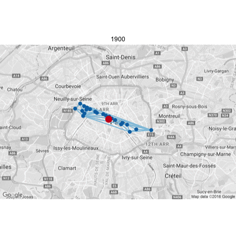
Maps with Change Over Time
We now have a good sense of what each city’s current metro system looks like, but how did these systems come to be this way? Now we’ll look at how these systems have changed and grown over time. That’s why at the beginning we made a column for opened_year. At this point the code gets less elegant but we’ll go through it step by step. It’s all the same principles as when we made our figures earlier.
The main idea of the following code is that we’re going to create unique triangulations for each year within each city. As more metro stations get added each year the triangulation will change. Just as we had data_deldir_delsgs and data_deldir_cent, we’re going to start by creating two empty data frames time_deldir_delsgs and time_deldir_sum (remember that our centroid data frame was based on the summary data). With our empty data frames initialized we can make a for loop. We want to go through each year, but for each city separately, so our first for loop goes through each city, filtering our data to only the city in question. Next we have our second for loop going through each year starting with the minimum year in the data for that city and up to 2015, the maximum year for the full data set. For a given year we filter to include only metro stops that were opened that year or earlier. We do equal to or less than because we don’t want to ignore metro stops from earlier years, we want the whole metro system as it exists for a given year. Note, we need at least three points to make a triangle, and you may think that a city wouldn’t ever have only one or two metro stops but you would be wrong (cough Barcelona cough) so we’re going to put a stop gap saying if the number of data points is less than three the loop should skip that year and move to the next one.
Okay, assuming there are at least three data points though we’re going to run the deldir() call and then save it in year_deldir. Then we create two new data frames. the first is year_deldir_delsgs which contains the delsgs information from deldir. We’re going to add two columns too, city and opened_year, so we know which city and year this data comes from. We then add this information to our existing time_deldir_delsgs data frame with a bind_rows() call. We then do the same thing to create year_deldir_sum, only we pull out the summary information from year_deldir instead of the delsgs information. We also add our city and opened_year columns and then bind_rows() it with time_deldir_sum. The loop does this for every city from the minimum year in the data up to 2015. See below the first and final 5 rows for the two data frames we created.
time_deldir_delsgs = data.frame()

time_deldir_sum = data.frame()

for(c in c("Paris", "Berlin", "Barcelona", "Prague")) {
  data_city = filter(data, city == c)
  for(year in min(data_city$opened_year):2015) {
    data_year = filter(data_city, opened_year <= year)

    # Add condition to skip if number of stops less than 3
    if(dim(data_year)[1] < 3) next            year_deldir = deldir(data_year$lon, data_year$lat)            year_deldir_delsgs = year_deldir$delsgs %>%
        mutate(city = c) %>%
        mutate(opened_year = year)

      time_deldir_delsgs = bind_rows(time_deldir_delsgs, year_deldir_delsgs)

      year_deldir_sum = year_deldir$summary %>%
        mutate(city = c) %>%
        mutate(opened_year = year)

      time_deldir_sum = bind_rows(time_deldir_sum, year_deldir_sum)
  }
}| x1 | y1 | x2 | y2 | ind1 | ind2 | city | opened_year |
| 2.358279 | 48.853428 | 2.36951 | 48.853024 | 11 | 2 | Paris | 1900 |
| 2.374377 | 48.844304 | 2.36951 | 48.853024 | 9 | 2 | Paris | 1900 |
| 2.374377 | 48.844304 | 2.358279 | 48.853428 | 9 | 11 | Paris | 1900 |
| 2.414484 | 48.846401 | 2.36951 | 48.853024 | 16 | 2 | Paris | 1900 |
| 2.414484 | 48.846401 | 2.374377 | 48.844304 | 16 | 9 | Paris | 1900 |
| 14.495654 | 50.121009 | 14.474094 | 50.104391 | 56 | 40 | Prague | 2015 |
| 14.495654 | 50.121009 | 14.485417 | 50.131361 | 56 | 53 | Prague | 2015 |
| 14.495654 | 50.121009 | 14.492467 | 50.103175 | 56 | 5 | Prague | 2015 |
| 14.495654 | 50.121009 | 14.514753 | 50.136703 | 56 | 26 | Prague | 2015 |
| 14.495654 | 50.121009 | 14.498242 | 50.119476 | 56 | 44 | Prague | 2015 |
| x | y | n.tri | del.area | n.wts | n.tside | nbpt | dir.area | dir.wts | city | opened_year |
| 2.289364 | 48.875775 | 4 | 0.000019 | 0.01251 | 4 | 2 | 0.000066 | 0.009329 | Paris | 1900 |
| 2.36951 | 48.853024 | 5 | 0.00007 | 0.047518 | 4 | 2 | 0.00052 | 0.073787 | Paris | 1900 |
| 2.290121 | 48.86685 | 5 | 0.000037 | 0.024907 | 5 | 0 | 0.000074 | 0.010541 | Paris | 1900 |
| 2.31331 | 48.867502 | 4 | 0.000037 | 0.024692 | 3 | 4 | 0.000388 | 0.054946 | Paris | 1900 |
| 2.2949 | 48.873934 | 5 | 0.000016 | 0.010551 | 3 | 2 | 0.000061 | 0.008594 | Paris | 1900 |
| 14.407383 | 50.069783 | 5 | 0.000052 | 0.002422 | 5 | 0 | 0.000064 | 0.001293 | Prague | 2015 |
| 14.417391 | 50.067381 | 5 | 0.000145 | 0.00679 | 5 | 0 | 0.000215 | 0.004342 | Prague | 2015 |
| 14.495654 | 50.121009 | 5 | 0.000201 | 0.00942 | 5 | 0 | 0.000212 | 0.004276 | Prague | 2015 |
| 14.470973 | 50.084002 | 5 | 0.000258 | 0.01209 | 5 | 0 | 0.00032 | 0.006478 | Prague | 2015 |
| 14.294662 | 50.059751 | 4 | 0.000283 | 0.013295 | 5 | 2 | 0.004465 | 0.09025 | Prague | 2015 |
As you may recall though we’re not necessarily interested in all the summary information, we just want it to compute our centroid. So, we make a new data frame time_deldir_cent. The code is the same as our earlier code for computing centroids, the only difference is that we’ll also group by opened_year, not just city, since we want unique centroids for each year for each city. See part of the data frame of the centroids below.
time_deldir_cent = time_deldir_sum %>%
  group_by(city, opened_year) %>%
  summarise(cent_x = sum(x * del.wts),
            cent_y = sum(y * del.wts)) %>%
ungroup()| city | opened_year | cent_x | cent_y |
| Barcelona | 1924 | 2.116838917 | 41.38132157 |
| Barcelona | 1925 | 2.120019157 | 41.3778193 |
| Barcelona | 1926 | 2.121921074 | 41.37833665 |
| Barcelona | 1927 | 2.121921074 | 41.37833665 |
| Barcelona | 1928 | 2.122324657 | 41.37383552 |
| Prague | 2011 | 14.45127993 | 50.07451041 |
| Prague | 2012 | 14.45127993 | 50.07451041 |
| Prague | 2013 | 14.45127993 | 50.07451041 |
| Prague | 2014 | 14.45127993 | 50.07451041 |
| Prague | 2015 | 14.44743871 | 50.07588187 |
There’s still one more thing I want to do before we make our figures. Right now the figures will have different start dates depending on when the first metro stop was built in a given city. Instead, I want all figures to start at the same year so we see them change over time with the same start date for each city. To do this we’ll make a new data frame called years that simply lists the years 1900 to 2015 four times, once for each city. We then do a left_join() with our data. As a result any time the opened_year in question is not found in the data frame for a given city an empty row will be added, empty except for the opened_year and city values. You’ll also notice that I filter()ed to only include decade years (1900, 1910, 1920, etc.), and the year 2015 so it includes the last year of our data. This is because if we include every year our gif will be very large and non-portable. Also it’s more dramatic to see changes every 10 years.
years = data.frame(opened_year = rep(seq(1900, 2015), 4),
                   city = c(rep("Paris", 116), rep("Berlin", 116),
                            rep("Barcelona", 116), rep("Prague", 116)))

data_time = left_join(years, data) %>%
  mutate(opened_by_year = ifelse(opened_year %% 10 == 0, opened_year,
                                 opened_year + (10 - (opened_year %% 10)))) %>%
  filter(opened_by_year <= 2010)

time_deldir_delsgs_sub = time_deldir_delsgs %>%
  filter(opened_year %% 10 == 0 | opened_year == 2015)

time_deldir_cent_sub = time_deldir_cent %>%
  filter(opened_year %% 10 == 0 | opened_year == 2015)
I kept saying we were going to make maps showing the change over time, but how are we going to do that? Well instead of building a single static plot for each city we’re going to build an animation where as the year changes so will the map. To do this we’ll use the package gganimate which works on top of ggplot2 (which is useful since we’re already using ggmap which works on top of ggplot2). We build our plot just as we would any other ggplot2 figure, but for data we want to add the frame setting. The frame is the thing in the plot that changes, in our case opened_year. Also, while we only want to plot the triangulations and centroids specific to a given year, we want the points for the metro stops to be additive. For example, when frame is 2000 we still want the points from 1990 to be plotted. To do this we add cumulative = TRUE to the call for those points. Finally, since we updated our data to include empty rows so that all plots start on 1900, all plots will have a frame starting at 1900, even if there are no data points to plot. I’ve again made a function to make our plots. See below for the code for the Paris map as well as all four animations. Also, notice that in 1920 (actually 1912) Barcelona gets their first metro stop…but doesn’t get anymore until 1930 (actually 1924). Take a look to see if you can find any other interesting things about how the systems changed over time.
library(gganimate)

time_plot = function(city_name, city_map){
  ggmap(city_map, extent = "device") +
    geom_segment(data = subset(time_deldir_delsgs_sub, city == city_name),
                 aes(x = x1, y = y1, xend = x2, yend = y2, frame = opened_year),
                 size = 1, color= "#92c5de") +
    geom_point(data = subset(data_time, city == city_name),
               aes(x = lon, y = lat, frame = opened_by_year, cumulative = TRUE),
               color = "#0571b0", size = 3) +
    geom_point(data = subset(time_deldir_cent_sub, city == city_name),
               aes(x = cent_x, y = cent_y, frame = opened_year),
               size = 6, color= "#ca0020")
}
paris_time.plot = time_plot("Paris", paris_map)
gg_animate(paris_time.plot)


Conclusion
In this post we looked at how the metro systems of four European cities changed over time. To do this we used a lot of different packages. We used the packages dplyr, tidyr, purrr, and ggplot2, which are all now a part of the package tidyverse. We used used two other plotting packages that build upon ggplot2, ggmap and gganimate. Finally we used the deldir package to make Delaunay triangulations and compute centroids of city metro systems over time. All of these skills can be applied to any other type of spacial data with unique shapes, and can be used to make your very own gifs. Try your city as a practice exercise!

This made me think of a really fun thing I might want to do with you (well it’d be your R thing, but I have the idea and maybe some data) about marshrutki in Georgia. Let’s talk about it 😉
2016-09-27 17:31 GMT+02:00 Page Piccinini :
> pagepiccinini posted: ” Table of Contents Introduction Data Maps with > Metro Stops Maps with Delaunay Triangulation and Centroids Maps with Change > Over Time Conclusion Introduction Metro systems are an interesting way to > learn more about the growth o” >
I’m typically to running a blog and i actually recognize your content. The article has actually peaks my interest. I am going to bookmark your site and preserve checking for new information.
Perfect piece of work you have done, this internet site is really cool with wonderful info .