Introduction
I am an unapologetic lover of boxplots, and as such I also am an unapologetic hater of barplots. Yet, about 90% of the time I’m asked to help someone make a figure in R, or more specifically in ggplot2, I’m asked for a barplot. So, this blog post is dedicated to why I think whenever possible you should use a boxplot over a barplot. If I’ve convinced you, there’s a handy summary provided at the end of the post that you can print out and distribute to any current barplot users.
TAKE AWAY POINTS FROM THIS POST
- Histograms are the best way to see the spread of your data.
- Boxplots are the next best way.
- Barplots are the worst way. Don’t use them.
Data
For today’s post I’ve created two sets of fake data, both of them have the same mean (100) and the same standard deviation (20), but as we’ll see they are very different in terms of their distributions.
Plots
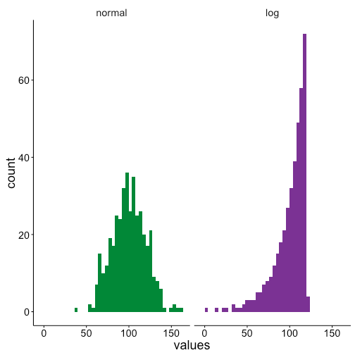
Histrogram
First we’ll make some histograms to show that the two data sets have clearly different distributions. The first data set has a normal distribution, but the second is logarithmic.
Boxplot
This difference can be seen in the boxplots too, although to a lesser extent than than the histograms. The box for the normal distribution has roughly evenly sized quartiles are either sides of the median, and only a couple outliers. Conversely the logarithmic data has a long left-skewed distribution, as can be seen by all of the low value outliers.

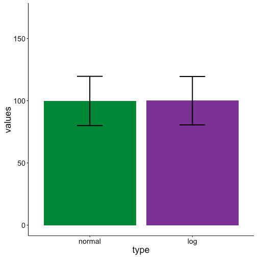
Barplot
Turning to our barplots we see that they are identical! Since both data sets have the same mean and standard deviation barplots completely lose the difference between the two data sets. This can be a problem if for example you wanted to run a statistical test to test for differences between these two groups. One, it’s a problem because many statistical tests require a normal distribution of the data, and a barplot will not warn you that part of your data is non-normal. Two, if you run a test only looking at means you won’t know that the two groups are different in regards to distributions.
Conclusion
Hopefully after this post you see that whenever plotting data with a distribution boxplots are preferred over barplots. If you want to spread the word feel free to distribute this handy summary. Happy (hopefully boxplot) plotting!

Thanks for this great post. I must admit that, while I see the value of box/violin/pirate plots, I still use barplots most of the time because, like most of us psycholinguists, I am usually looking at interactions and therefore I want my plots to be grouped in some way. It’s easy to group the bars in barplot() with beside=T, but I’m not aware of an easy way to do it in boxplot(), violin(), or pirateplot() (although I did just find this thread http://stats.stackexchange.com/questions/11406/boxplot-with-respect-to-two-factors-using-ggplot2-in-r with some ggplot examples that look like they accomplish it for boxplots). Do you know of any easy ways to make a box or violin plot group things? (Or else I guess maybe I should just stop being a ggplot2-eschewing Luddite and start making grouped violin plots in ggplot2. Or start using pirate plots, which I think have this ability built in, although I haven’t done it yet because they’re so new and I’m not sure how they’ll be received.)
The other reason I’ve avoided boxplots is because I like to plot a 95% CI (usually a 95% within-subject CI) of the mean, whereas I don’t yet know the math behind how people estimate the CI for the median and thus I don’t trust notched boxplots. (I also don’t trust the HDI that’s plotted in a pirate plot because I don’t know the math behind it yet, so I’m not sure how I can interpret it relative to a within-subject CI; I should probably read up on this someday.) In general, I like the boxplot() gives me full control over what I want to plot (since I set up everything manually I can feed it, for example, the values of a within-subject rather than a between-subject CI when I hack the error bars), whereas I’m wary of functions like violinplot() and ggplot2 stuff that seem to be doing the calculations for me…
I glad to hear you liked the post! I actually find box plots much easier to make in R than bar plots. Per the link you posted, you can either do the interaction syntax for the Lattice plot version, boxplot(dep_var ~ var1 + var2), or setting “x” and “fill” with the ggplot2 version, ggplot(data, aes(y = dep_var, x = var1, fill = var2) + geom_boxplot(). In general though, I find box plots easier to make because I have less pre-processing of the data to do. With a box plot I can generally directly call my original data and plot that, while with a bar plot I have to summarize the data to get means and standard deviation or error before plotting. I appreciate the “black box” concerns of some of the plotting in R. I have found the help pages to be pretty clear for both boxplot.stats() and geom_boxplot() for what exactly is being plotted as notches, while for other newer types of plots it is less transparent.
I suppose a lot of it also depends on your statistics. When by-subject ANOVAs were the norm I can see why people plotted bar plots, first getting averages for each subject, plotting the average of those averages, and then the standard error based on the number of subjects. However, now that people have moved to linear mixed effects models, where you use all data points, it’s less clear to me how best to compute the mean of the data or error bars. As a result, I prefer box plots since then I can just show all the data without having to make any explicit decisions about summarizing or taking various means before plotting.
Thanks for the input! I’m glad to see I can boxplot without using ggplot2… maybe that’ll spur me to do them more! That’s also a good point you make about what to do with means and error bars when we’re using mixed models… recently I’ve been using Cousineau-Morey confidence intervals for my error bars but I have indeed had some doubts about that since those are based on my subject means, aggregated over items. (I’ve fiddled around with taking the SEs from my model summary, or using confidence intervals from bootMer, but so far they haven’t given me reasonable-looking error bars, in that conditions I know to be different from my stats don’t always look different with these error bars…I might be doing it wrong, though). So yeah, plotting the data in a more method-neutral way without committing to any particular kind of mean or CI could be a reasonable way to go (although on the other hand I do like to have something there that people can roughly interpret as a CI, in case people feel like comparing any pair of means that I myself wasn’t interested in comparing). This gives me a lot to think about next time I plot something!
keep up the good work, I read few blog posts on this internet site and I believe that your site is real interesting and contains sets of great information.
I believe this web site has very good written written content content.
This actually answered my problem, thank you!
I like this web site very much so much superb information.
very interesting details you have remarked, thankyou for posting.